LFP - Large-Format-Printing
Creating powerful commercial signage for your business

Tuesday 18. March 2014 - The first impression for many businesses is their signage: it is what draws the consumer's eye in and, if done right, has the potential to increase business. Commercial signage for any business is the cornerstone of the branding needed to inform potential customers about the goods or services the business offers, and a major tool for setting a particular tone for the brand. In essence, high-quality and effective commercial signage is an investment in a business's brand identity.
Add just enough information
Whether a company is a nail salon, clothing boutique or coffee house, the first impression and opportunity to appeal to future consumers is what’s outside their doors, and the most powerful signs have a balance of offering just enough information not to overwhelm the viewer and enough visual appeal to make them want to learn more.
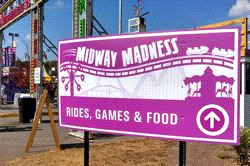
When creating a sign for your business, think about what information is the most important to communicate and what information would best help propel the brand. If your business is known for being the most affordable local shop, or has the largest selection of what you sell, make sure to include that information on your sign. Regardless of the information you choose to display, be sure that the sign remains simple and clear. If your sign is too cluttered, it may actually become less memorable, since potential customers might drive or walk on by without actually knowing what your company offers.
Set the right tone
Color combinations on commercial signage are also integral to setting the right tone for your brand. Is your company a fair trade coffee house? Then consider using neutral, earthy tones to give the feeling of warmth, with bold, black lettering. Do you run a chain of daycare centers? Consider adding youthful, vibrant colors such as orange, green and yellow to emit feelings of happiness, health and joy.
Shapes are also important to setting the right tone for your company. In general, circles, ovals and ellipses tend to project a positive emotional message. Using a circle or oval border can suggest community, friendship, love, relationships, and unity, which would work well for real estate signage, religious organizations and healthcare.
You can learn a lot by looking at the logos of all types of Virginia businesses and how they tailor the color, look and design of their signage to express something fundamental about what they do Pentagon MMA, a mixed martial arts studio, has a colorful, textured logo with diagonals and asymmetrical elements, suggesting movement and struggle, while Virginia ADT Home Security has a simple logo with white letters on a blue field, suggesting strength, tranquility and trustworthiness.
Before you invest a lot of money in commercial signage, make sure you have a third party take a look at the design, so as to avoid disastrous situations. Remember to keep your signage clear, simple and appropriately toned for your business and you’ll be on the road to increased interest from prospects and customers.
