Prepress
CGS meets ORIS

Tuesday 21. July 2020 - After 35 years of success it is time for a fresh new look: CGS ORIS, a global leader in color management, launches a new corporate image and brand identity - finally connecting what has always belonged together.
“CGS Publishing Technologies International GmbH”, was founded in 1985 by two young men with mutual visions and ideas. It is a true “start-up” story, as more commonly seen today. With a history that includes journeys to Silicon Valley promoting innovative solutions for the graphics industry in the very early days and birth of desktop publishing.
Today, CGS ORIS employs roughly 80 people internationally, with offices all over the world. With development headquarters still based in the picturesque German village of Hainburg where the dream was born. It is a beautiful contrast between the buildings original brick structure dating back to 1911 and the innovative color management, proofing software solutions and specially formulated media for the graphic arts industry, developed here for the past 35 years.
This jubilee has triggered a lot of reflection and many new ideas. Bernd Rückert, CEO of CGS ORIS, and Isabel Bracker, Manager of Communications, elaborate on the intensive creative and conceptual phases they went through over the past few months.
One of the biggest changes? The new brand name “CGS ORIS”. “After doing business for several decades in nearly every country in the world, we came to realize in some places our company was known as CGS, in others we were more commonly known as ORIS. CGS is the abbreviated version of the company and ORIS the product family name. We have now combined what has always belonged together to focus on a singular strong brand for the future. Making it much simpler to identify products with CGS ORIS technology inside”, Rückert comments.
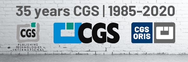
Without ever forgetting the company roots, some branding elements will remain consistent: As an example, the new company logo (on the right side in the image below) still incorporates the well-known graphic imagery. “In earlier designs it represented a computer with a green power button and the text below creating a keyboard”, Rückert explains (cf. logo on the left logo).
Furthermore, the primary brand color has changed slightly with a darker appearance and the new grey replaces the green color used in the past. “The new colors fit us perfectly, our corporate identity and the new look and feel for 2020 and beyond. The colors are an ideal choice, even in combination with our existing product color palette that serves as a consistent part of the overall theme”, Bracker comments.
“Of course, the original concept was to celebrate our 35th jubilee at drupa and present the new branding launch at our booth with a large party and celebration planned. But nevertheless, we are very pleased with the results – and we still have many new announcements planned in the coming weeks ahead. Our software user interface will receive a fresh new look and there are many other creative advancements planned in the near future”, she adds.
Currently, CGS ORIS is conducting intensive research and development in the area of expanded/multicolor printing, CxF prediction and color data exchange as well as packaging and industrial printing.
