Inkjet & Digital Printing
Xerox Selects Clear as its Inaugural Color of The Year 2020

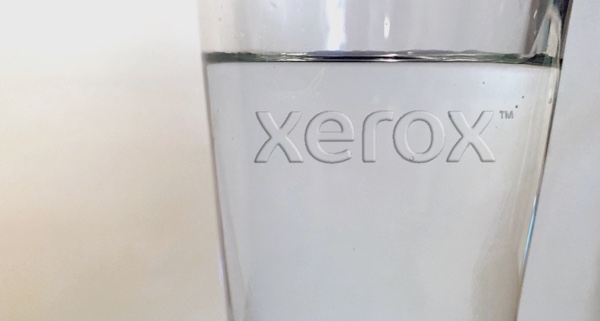
Tuesday 15. October 2019 - Is clear a color? We think so. You may not, and thats fine. Looking ahead to 2020, Xerox today announced its inaugural Color of the Year: Clear.
While acknowledging debates as to whether the absence of all colors is itself a color (it is), Xerox stands by its choice of clear, the same color (or non-color) as fishbowls, windows and cellophane.
Just as these transparent surfaces give us a view into what lies behind them, Xeroxs Color of the Year showcases the importance of creating a fresh look into an unobstructed future, in hopeful yet clear-eyed anticipation of what lies ahead.
“It can enhance a color, it can brighten a color, it can sometimes add saturation to a color,” said Beatriz Custode, Color Customization & Engineering Services at Xerox.
For centuries, artists from Leonardo Da Vinci to Elisabeth Louise Vigée Le Brun have used layers of clear, called glaze, in their masterpieces – to add depth and texture or make them sparkle in the light. Even for those who arent fine artists, clear changes how we see the world. For example, house paints are typically available in different levels of gloss or semi-gloss allowing for a similarly shiny, reflective effect, and high-gloss paint washes easier than a Rembrandt.
In printing, Xerox technology such as the iGen 5 Press, Iridesse Production Press, and new PrimeLink C9065/C9070 lets creatives use clear ink in their projects as readily as other colors, including metallics and fluorescents.
